고정 헤더 영역
상세 컨텐츠
본문
이번 시간에는 Material Dialog를 사용자가 직접 꾸며보는
방법을 알아보겠습니다.
1. 라이브러리 등록
build.gradle(Module:프로젝트명:app)
dependencies 괄호 안에 아래 코드를 넣어주시면 됩니다.
implementation 'com.google.android.material:material:1.4.0'
2. 테마 수정 themes.xml
( res -> value -> themes)
style 태그 속성 parent를 아래 코드로 변경해주시면 됩니다.
<style name="Theme.MaterialExam" parent="Theme.MaterialComponents.Light.DarkActionBar">
3. 테마 등록 themes.xml
( res -> value -> themes)
 <style name="MaterialDialog_custom_Style" parent="ThemeOverlay.MaterialComponents.MaterialAlertDialog">
        <item name="colorPrimary">@color/pink_100</item>
        <item name="colorSecondary">@color/pink_100</item>
        <item name="colorSurface">@color/pink_50</item><!-- 바탕색깔-->
        <item name="colorOnSurface">@color/black_800</item> <!-- 라디오 버튼 텍스트 색깔-->
        <item name="colorAccent">@color/yello_600</item> <!-- 라디오버튼 동그라미 색깔-->
        <item name="alertDialogStyle">@style/MaterialAlertDialog.App</item>
        <item name="materialAlertDialogTitleTextStyle">@style/MaterialAlertDialog.App.Title.Text</item>

        <!-- 버튼 스타일 설정-->
        <item name="buttonBarNeutralButtonStyle">@style/Widget.App.Button</item>
        <item name="buttonBarPositiveButtonStyle">@style/Widget.App.Button</item>
        <item name="buttonBarNegativeButtonStyle">@style/Widget.App.Button</item>
    </style>

    <style name="MaterialAlertDialog.App" parent="MaterialAlertDialog.MaterialComponents">
        <item name="shapeAppearance">@style/ShapeAppearance.App.MediumComponent</item>
    </style>

    <!-- 타이틀 색깔 -->
    <style name="MaterialAlertDialog.App.Title.Text" parent="MaterialAlertDialog.MaterialComponents.Title.Text">
        <item name="android:textColor">@color/red700</item>
    </style>


    <style name="Widget.App.Button" parent="Widget.MaterialComponents.Button.TextButton.Dialog">
        <item name="materialThemeOverlay">@style/ThemeOverlay.App.Button</item>
        <item name="shapeAppearance">@style/ShapeAppearance.App.SmallComponent</item>
    </style>

    <!-- 버튼 색깔 -->
    <style name="ThemeOverlay.App.Button" parent="">
        <item name="colorPrimary">@color/right_blue_700</item>
    </style>

    <style name="ShapeAppearance.App.MediumComponent" parent="ShapeAppearance.MaterialComponents.MediumComponent">
        <item name="cornerFamily">cut</item>
        <item name="cornerSize">8dp</item>
    </style>

    <style name="ShapeAppearance.App.SmallComponent" parent="ShapeAppearance.MaterialComponents.SmallComponent">
        <item name="cornerFamily">cut</item>
        <item name="cornerSize">4dp</item>
    </style>
3-1 색상정보
<color name="pink_100">#F8BBD0</color>
<color name="pink_50">#FCE4EC</color>
<color name="pink_900">#880E4F</color>
<color name="black_800">#424242</color>
<color name="yello_600">#FDD835</color>
<color name="green_100">#B9F6CA</color>
<color name="right_blue_700">#0091EA</color>
4. 메인화면 구성 activity_main.xml
<?xml version="1.0" encoding="utf-8"?>
<LinearLayout xmlns:android="http://schemas.android.com/apk/res/android"
    xmlns:app="http://schemas.android.com/apk/res-auto"
    xmlns:tools="http://schemas.android.com/tools"
    android:layout_width="match_parent"
    android:layout_height="match_parent"
    android:gravity="center"
    android:orientation="vertical"
    tools:context=".MainActivity">

    <com.google.android.material.button.MaterialButton
        style="@style/Widget.MaterialComponents.Button.OutlinedButton"
        android:id="@+id/btn_themeDialog"
        android:layout_width="match_parent"
        android:layout_height="wrap_content"
        android:text="Theming Dialog"
        />

</LinearLayout>
5. 메인코드 기능 구현 MainActivity.java
import android.content.Context;
import android.content.DialogInterface;
import android.os.Bundle;
import android.view.View;
import android.widget.Button;
import android.widget.Toast;

import androidx.appcompat.app.AppCompatActivity;

import com.google.android.material.dialog.MaterialAlertDialogBuilder;


public class MainActivity extends AppCompatActivity {

    int indexId = 0;

    String colorList[] = {"Red", "Blue", "Green"};

    @Override
    protected void onCreate(Bundle savedInstanceState) {
        super.onCreate(savedInstanceState);
        setContentView(R.layout.activity_main);

        Button btn_alertDialog = findViewById(R.id.btn_themeDialog);
        btn_alertDialog.setOnClickListener(new View.OnClickListener() {
            @Override
            public void onClick(View view) {
                showThemeDialog();
            }
        });


    }

    /**
     * 사용자 정의 대화상자
     */
    private void showThemeDialog() {

        Context context = MainActivity.this;

        String[] selectId = {colorList[indexId]};

        MaterialAlertDialogBuilder builder = new MaterialAlertDialogBuilder(context, R.style.MaterialDialog_custom_Style);
        builder.setTitle("Title")
                .setSingleChoiceItems(colorList, indexId, new DialogInterface.OnClickListener() {
                    @Override
                    public void onClick(DialogInterface dialogInterface, int which) {

                        indexId = which;
                        selectId[0] = colorList[which];
                    }
                })
                .setNegativeButton("Cancle", new DialogInterface.OnClickListener() {
                    @Override
                    public void onClick(DialogInterface dialogInterface, int i) {
                        Toast.makeText(getApplicationContext(), "취소", Toast.LENGTH_SHORT).show();
                    }
                })

                .setPositiveButton("OK", new DialogInterface.OnClickListener() {
                    @Override
                    public void onClick(DialogInterface dialogInterface, int i) {
                        Toast.makeText(getApplicationContext(), selectId[0] + " 선택했습니다.", Toast.LENGTH_SHORT).show();
                    }
                }).show();

    }
}
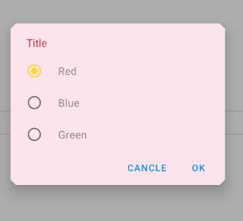
6. 실행화면
반응형
'안드로이드' 카테고리의 다른 글
| [안드로이드] Material Tabs Custom 하는 방법 (0) | 2021.12.17 |
|---|---|
| [안드로이드] Material tabs [Fixed tabs, Scrollable tabs] 쉽게 만드는 방법 (0) | 2021.12.16 |
| [안드로이드] Material Dialog [ Alert dialog , Simple dialog , Confirmation dialog ] 쉽게 만드는 방법 (0) | 2021.12.14 |
| [안드로이드] Material Dropdown menu 쉽게 만드는 방법 (0) | 2021.12.13 |
| [안드로이드] Custom Spinner 쉽게 만드는 방법 (0) | 2021.12.12 |


댓글 영역